弹性布局的核心思想,是对容器及其内部元素进行排版,并控制子元素以合适的方式填充可用空间。 在弹性布局模型中,弹性容器的子元素可以在任何方向上排布,也可以“弹性伸缩”其尺寸,既可以增加尺寸以填满未使用的空间,也可以收缩尺寸以避免父元素溢出。 子元素的水平对齐和垂直对齐都能很方便的进行操控。通过嵌套这些框可以在两个维度上构建布局。
Concepts

Flex 容器 文档中采用了 flexbox 的区域就叫做 flex 容器。把一个容器的 display 属性值改为 flex 或者 inline-flex 即可创建一个 flex 容器。
Flex 模型包含主轴和交叉轴两根轴线,其内部元素将沿着主轴或者交叉轴对齐进行对其。flexbox 的所有属性都跟这两根轴线有关。
- main axis —— 主轴,受 flex 容器属性 flex-direction 的影响,取值
row,row-reverse主轴将沿着水平方向延伸; 取值column,column-reverse,则主轴将沿着上下方向延伸。 - main-start | main-end —— flex-item 在容器内的流动方向是从
main-start到main-end。 需要注意,如果 flex-direction 是row,则起始点和终止点不一定总是左边和右边,这还取决于文字书写方向,当处于从右到左的书写环境时,则起始点在右边而终止点在左边。 - cross axis —— 交叉轴,始终垂直于 main axis。
- cross-start|cross-end —— flex-lines 在容器内的流动方向是从
cross-start到cross-end。
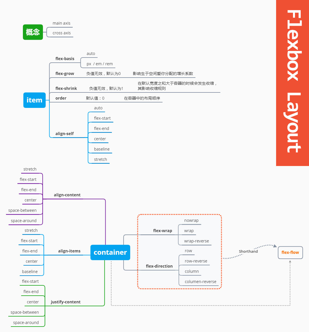
align-content
当在多行内容场景下,定义行在交叉轴上的对齐方式。仅在多行时有效。
align-content: stretch;     /*默认值*/
align-content: flex-start;
align-content: flex-end;
align-content: center;
align-content: space-between;
align-content: space-around;
align-items
定义Flexbox的 item 如何在交叉轴上对齐。
align-items: flex-start;
align-items: flex-end;
align-items: center;
align-items: baseline;
align-items: stretch;
align-self
其特性与 align-items 相同,其区别在于,仅应用与单个 item 中。
align-self: auto;   /*默认值*/
align-self: flex-start;
align-self: flex-end;
align-self: center;
align-self: baseline;
align-self: stretch;
flex-basis
定义 flex 元素的初始大小。如果不使用 box-sizing 改变盒模型的话,那么这个属性就决定了 flex 元素的内容盒(content-box)的尺寸。 当一个元素同时被设置了 flex-basis (除值为 auto 外) 和 width (或者在 flex-direction: column 情况下设置了height) , flex-basis 具有更高的优先级。
flex-basis: auto;   /*默认值*/
flex-basis: 80px;
flex-direction
指定内部元素是如何在 flex 容器中布局,定义主轴的方向。
flex-direction: row;        /*默认值*/
flex-direction: row-reverse;
flex-direction: column;
flex-direction: column-reverse;
flex-flow
该属性是 flex-direction 和 flex-wrap 的简写模式。
flex-grow
设置一个 flex 项的增长系数,如果有可用空间,将按该系数分配空间。
flex-grow: 0; /*默认值*/
flex-shrink
设置一个 flex 项的压缩系数,如果没有可用空间,将按该系数对其压缩。
flex-shrink: 1;
flex-wrap
指定 flex 元素单行显示还是多行显示 。如果允许换行,这个属性允许你控制行的堆叠方向。
flex-wrap: nowrap;    /*默认值*/
flex-wrap: wrap;
flex-wrap: wrap-reverse;
justify-content
定义 item 如何在主轴上对齐。
justify-content: flex-start;    /*默认值*/
justify-content: flex-end;
justify-content: center;
justify-content: space-between;
justify-content: space-around;
order
指定 flex item 在列表中的顺序
order: 0; /*默认值*/